USPS Redesign
USPS Redesign
Redesigning the USPS brand and user experience
Assignment — UCLA Extension
Scroll ↓
Summary
A look into the United States Postal Service and the changes it needs to survive current life events (post-COVID-19)-
Team Lead (2 Weeks), UX Designer, Researcher, UI Designer, Prototyper, Ideator
-
Figma, InVision, Pen & Paper
-
Mobile, Digital Kiosk, In-Person Service Design
The Challenge
Our mission is to reimagine current USPS experiences so that the agency has an earnest chance of survival amidst the current pandemic (COVID-19). We seek to understand and build solutions that bring relevancy back to the agency so it can continue to be an integrated part of our evolving society.SustainabilityIncrease service adoption and usageEnhance awarenessAddress needs and pain points of users and stakeholders
SafetyMinimize close contact and proximity with people
Problem Statement
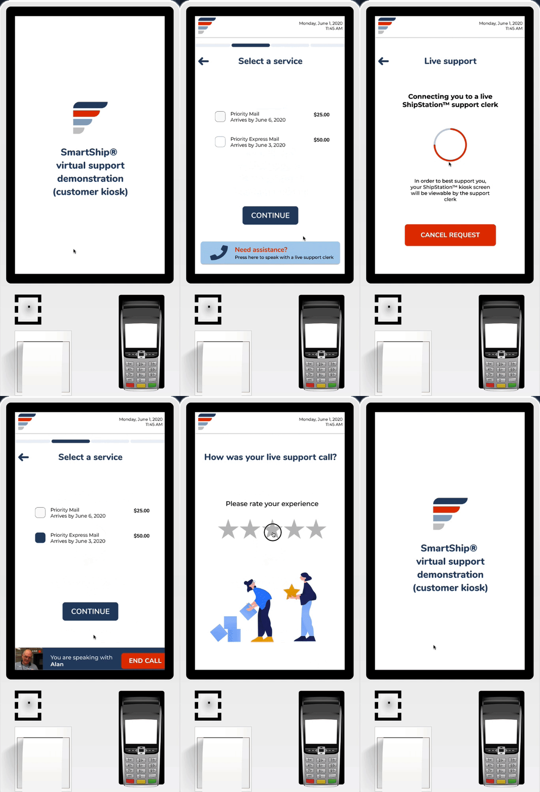
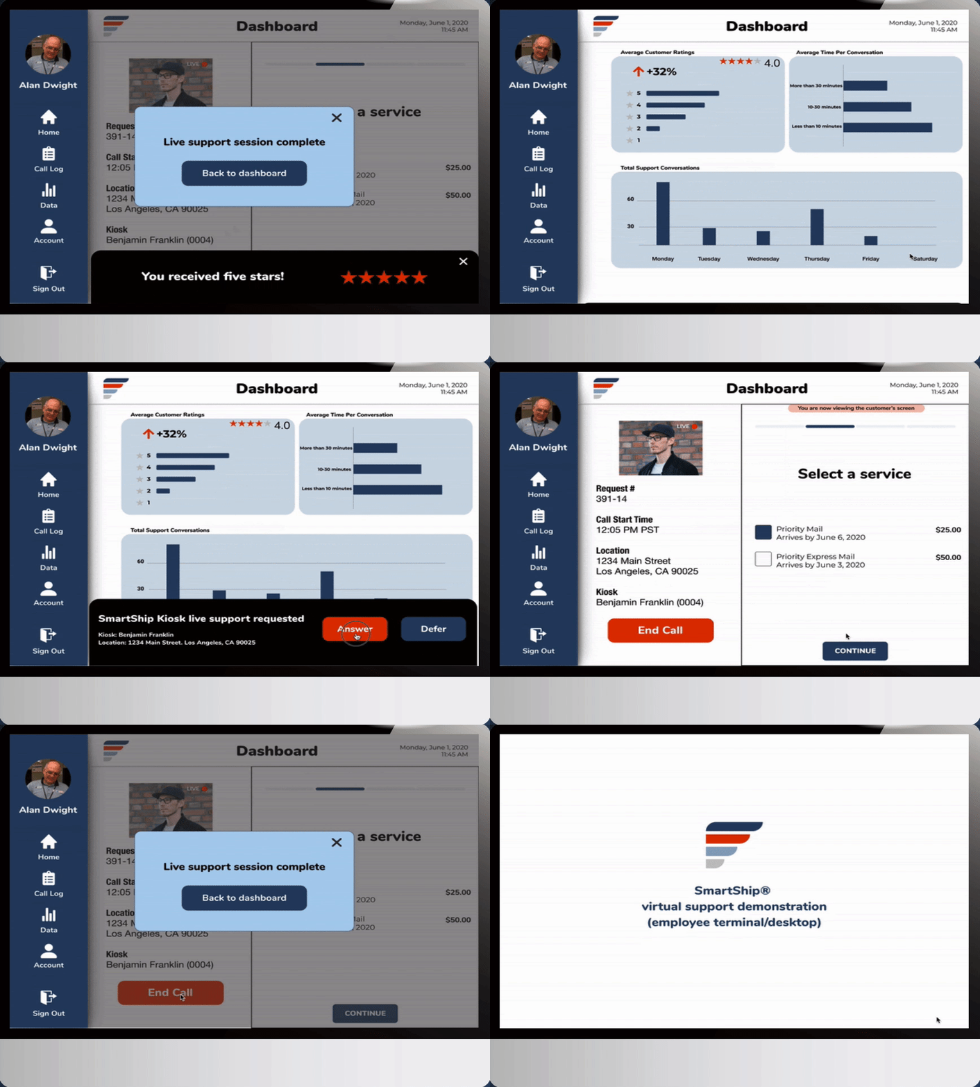
How might we reimagine the outdated self-service kiosk experience so that mobile and digitally-dependent customers feel the service is safer, more accessible, and valuable, while offering enhanced opportunities for customer interactions by USPS clerks?
User Personas — Customer & Employee
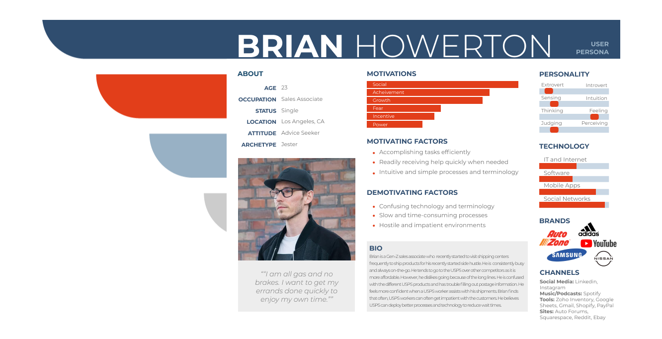
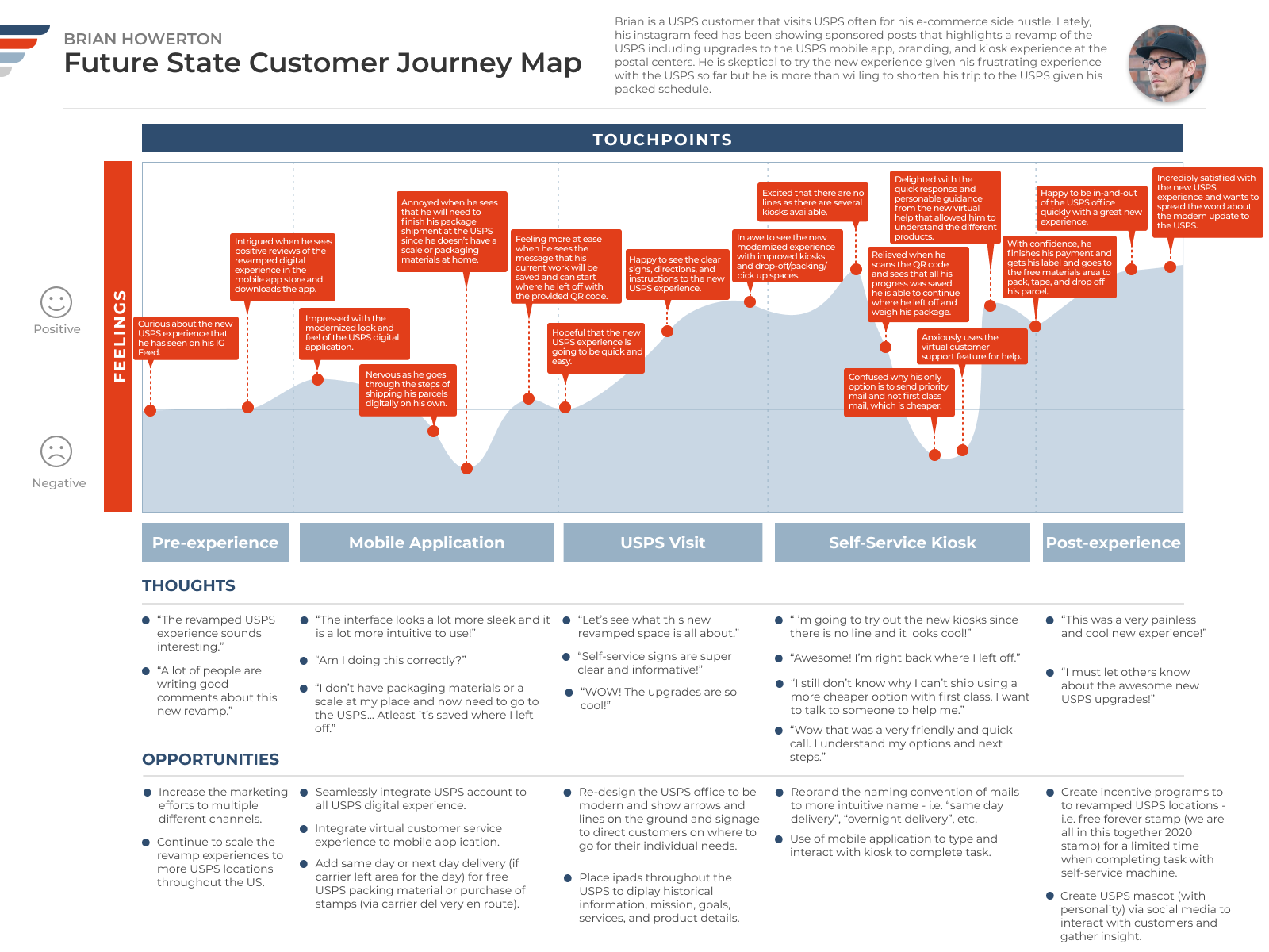
We wanted to embody the user persona that epitomizes the user persona that presented as an average USPS customer. We felt that Brian (presented below) was the right persona for our study in that he is a frequent user of mailing systems and have dealt with many different obstacles while being a customer.To complement Brian’s profile, we wanted to introduce a stakeholder who knew USPS inside and out. Alan presents the employee side of the postal service. He is a character that is very involved in the USPS and would be one who is affected most by any changes within the system.Current State Customer Journey Map
The current state of the customer journey indicates the pain points of the average USPS customer. Design Concept
To stay current with the times, we added a new spin on the classic, All-American USPS look and feel. Instead of the loud and bold colors of red, white, and blue, we focused on using muted, deep colors of each hue. Allowing this new change signifies to the customer that USPS is heading towards a new change and direction that also shows improvements in their system. USPS Experience Scenario
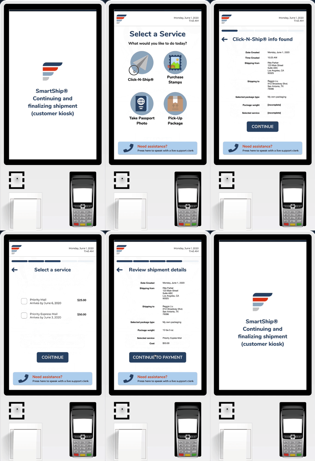
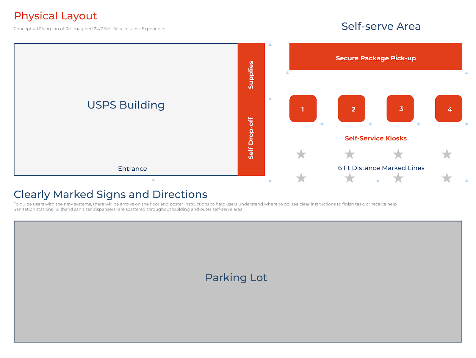
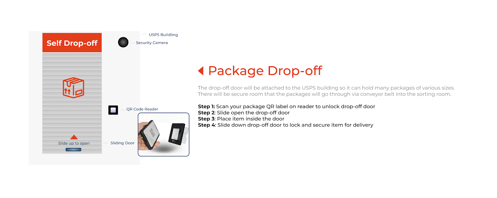
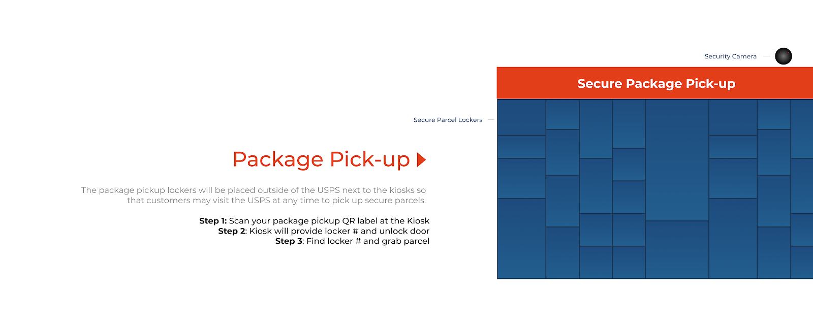
During our site visits, we noticed the USPS buildings needed upgrading in many areas. Because of COVID-19 and social distancing guidelines, we wanted to implement a safe method for customers to receive their packages with minimal direct human contact. Shipping A Package Via The Mobile App
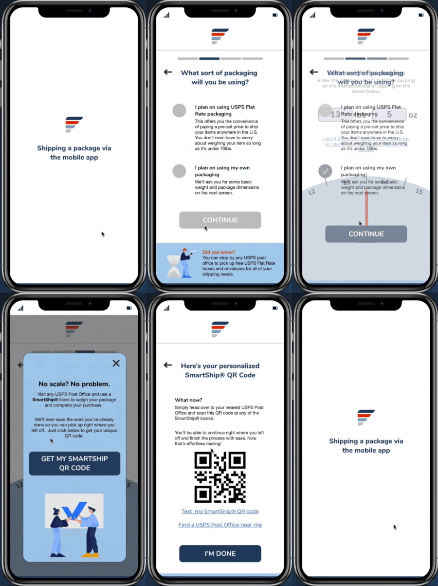
The customer uses the USPS mobile app to save time and avoid waiting in line.
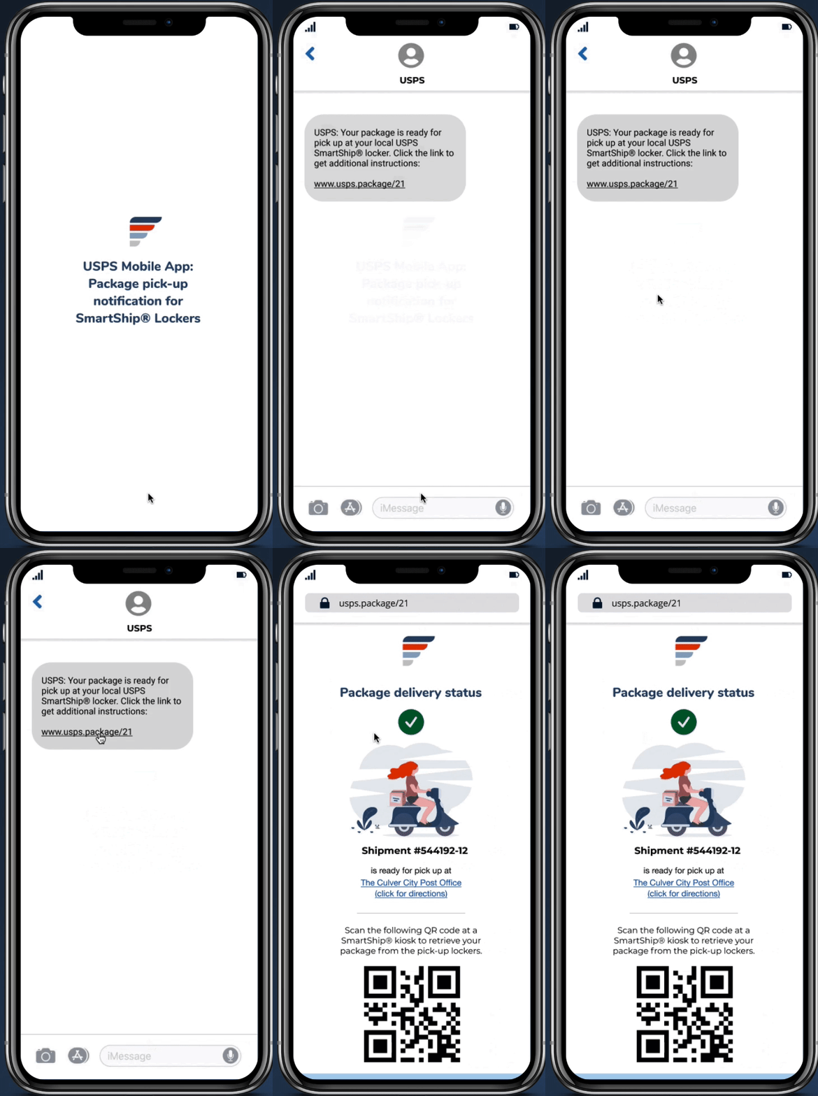
USPS Mobile App: Package Pick-Up Notification for SmartShip Lockers
The USPS Mobile App will notify the customer to pick up any packages sent to a SmartShip Locker location.
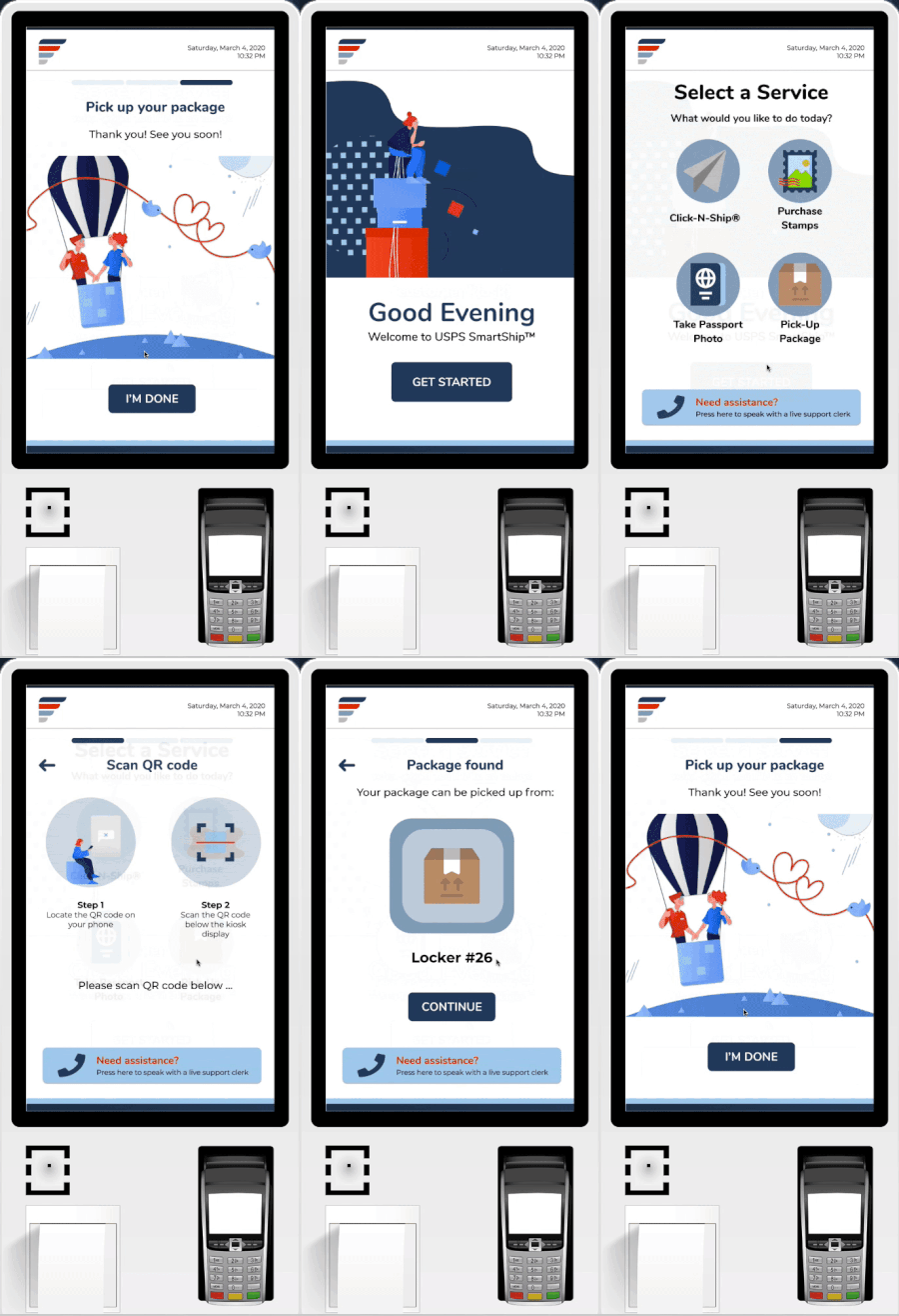
Simple and easy, using a QR code to retrieve your package

